
Adding a feature to an app designed for tracking and splitting expenses among friends/ family.
Role
UX/UI designer & researcher
Timeline
5 weeks


Overview
Background
Splitwise is a free app that allows consumers to split expenses with friends. If a group needs to share the cost, it lets you and your friends add various bills and keep track of who owes who, and then it helps you to settle up with each other.
Problem
Users of the application have to leave the app to make payments/transfers; adding a couple extra steps that often result in missed payments.
The Solution

Research
Goals
We want to know the issues that users face when using the Splitwise app so that we can add a feature that will help solve or mediate the problems faced.
Objectives
-
Understand what users like and dislike about the app
-
Learn how users are currently receiving and making payments when using the app
-
Determine if there gaps that can be closed by adding any features or improvements to current features in the app
Key Findings

would like payment platforms to be incorporated into Splitwise

use PayNow as their primary payment method
Pain Points
Users have to text their friends to request for money and check their bank accounts to confirm they have received the payment
Wishes/ Gaps
People wished they had a currency converter, and a messaging or notification function within the app.
Competitor Analysis
I did a competitive analysis to gather insights into other payment platforms. This helped me to decide how best to add a feature to Splitwise to elevate the user experience.
Google Pay
VALUE PROPOSITION
-
Established payment app that links directly to bank account
STRENGTHS
-
Recognised and large user pool
-
Incentives for using app e.g. cashback
WEAKNESSES
-
Does not track overall spending
Splid
VALUE PROPOSITION
-
No sign-up required and works offline
STRENGTHS
-
PDF/excel summaries can be downloaded (in-app purchase)
WEAKNESSES
-
Expenses keyed in can be edited by group members (can only use with people you are close to)
Tricount
VALUE PROPOSITION
-
Established payment app that links directly to bank account
STRENGTHS
-
Recognised and large user pool
-
Incentives for using app e.g. cashback
WEAKNESSES
-
Does not track overall spending
These findings led me to think about how we might be able to close the gaps that exist in the Splitwise app. Perhaps we might be able to add a feature that allows seamless transition to the payment platforms. Perhaps we might be able to include a messaging function for ease of use.
Define
Storyboard
I created a storyboard to better understand my user, and to empathize with the user through story telling.

Project Goals
I took some time to list out the various goals for this project; to especially keep in mind the business considerations when designing for the user.
Main goal for the business: to keep users on the app
Main goal for the user: to make and receive seamless and easy payments.

Target Users
From my research, I narrowed my user persona down to designing for David, a busy business executive who would like things as seamless and quick as possible.

I would like to find ways to help users to make and receive payments easily because they want to reduce the time that they spend waiting to pay or receive payment.
I would like to help users to know when expenses have been settled because we do not want it to affect their relationships negatively.
Ideate
Tackling the Problem
To help improve the experience for my users, it was also helpful to think about some questions.
How might we improve the payment splitting experience for users?
How might we help users to make payments in a timely manner without having to take additional/unnecessary steps?
Journey Map
Visualising the user experience through a journey map enabled me to put myself in the user's shoes; and ensure a positive experience through the additional feature.
Scenario: David uses Splitwise once to twice a week when he has meals with his friends or family members. He tends to pay first and then puts the amount into Splitwise to remind the rest to transfer him their share. However, he often does not get paid back and he finds it difficult to request for payment.
Expectations:
- Seamless integration of payment platforms for easy transfer of money
- Money is returned in the shortest time possible

User & Task Flows
I created a user flow and two task flows to define how a user would use the app if the payment platforms were incorporated into it.
My main aim was to keep the user experience as similar to the usual as possible, with very minor inclusions that feel natural and easy.
User Flow

Task Flow 1
(payment app incorporation)
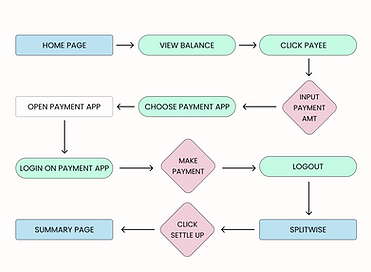
Task Flow 2
(enabling notifications)

Bringing It Together
The additional features worked into the existing site map as such; with minimal intrusion to the original site map. This helped to elevate the user experience and not hinder the main use of the app at all.

Design
Low & Mid-Fi Wireframes
I took screenshots from the current Splitwise app to compare the current interface with the features that I wanted to add. This also aligned with the aim of keeping to minimal changes only.

High-Fi Wireframes
As this project involved adding a feature, the designs had to adhere to the pre-existing design system.
Again, the main objective was to make the additions and changes as seamless as possible.
Payment platform incorporation
I chose to include this screen right after keying in the amount for settling up; so that it provides the user with a seamless flow. The modes of payment included were the most commonly used platforms.


Messaging function
I included a "message/WhatsApp" function under notifications so that users can choose if they would like to be notified when an expense is due or paid to them. This is the most personal way to reach users, compared to app notifications or emails.


Tests & Iterations
Usability Testing Insights
Usability testing was done with the same users who had been surveyed at the beginning of the project.
The testing revealed that users responded positively to the addition of the payment feature. Iterations were then focused on refining micro-interactions for a smoother experience.
Successes
Overall, users enjoyed the new feature added
"I like the payment feature!"
"This is great, so seamless."
Pain Points
Users highlighted that it is not very clear when payment has been settled—the text is small and not distinct.
“The balance page looks almost the same as before"
Suggestions
-
Maybe include an auto screenshot of the payment confirmation page
-
Modes of payment page for users to pick their preferred apps to link
-
"No thanks" option for users who choose not to link their payment platform
Iterations
Based on the feedback I received, and after prioritizing the revisions, I decided to focus on the following:

Pop-up Notification
Users will see a pop-up box after payment is settled; allowing them to rest easy.
"No Thanks" Option

Users have the option to pick "no thanks" if they choose not to link their payment platforms.

Modes of Payment
Users can pick and add in their mode of payment under their Account settings.
Reflection
Learnings
As a user of the Splitwise app myself, I was happy to add a feature that I would like to use as well. It was also interesting to hear from other users about their experiences and see things from their vantage points instead.
It is also not the easiest to work with an app that has already been designed; as there is less creative liberty to change things according to my own preferences.
Areas of Improvement
As Splitwise is not very widely used in Singapore yet, I did not have many users to interview. However, if I had more time, I would have interviewed more people to hear their thoughts about the app first.
The feature was well-liked by those who tested it; and it seems to provide a seamless user experience. Over time we would be able to observe the true impact that it makes on the users, and if additional iterations need to be made.


